Customize the Portal Menus
Last updated:
Attention:
You’ve reached a page related to the Tyk Classic Portal. If you were searching for API documentation of the new Tyk Developer Portal please use the latest Postman collection page. Future deprecation of Tyk Classic Portal
This product is no longer actively developed as it has been superseded by the new Tyk Developer Portal. Please note that the Tyk Classic Portal now has limited support and maintenance. Please contact us at [email protected]if you have any questions.
The Portal supports a data structure to hold rudimentary menus, all pages have access to all menus, and can be accessed using the .Menus.MenuName field tag. They are arrays that consist of slugs and names, an implementation example would be:
<ul class="nav navbar-nav">
  {{ range $index, $menuItem := .Menus.Main}}
  <li><a href="/portal/{{$menuItem.URL}}">{{$menuItem.Title}}</a></li>
  {{ end }}
  <li><a href="/portal/apis/">API Catalog</a></li>
  {{ if not .PortalConfig.DisableSignup }}
    {{ if not .UserData }}
    <li><a href="/portal/register/">Register</a></li>
    {{ end }}
  {{ end }}
  {{ if not .PortalConfig.DisableLogin }}
    {{ if not .UserData }}
    <li><a href="/portal/login/">Log in</a></li>
    {{ end }}
  {{ end }}
</ul>
In the snippet above we can also see a set of settings fields, in order to react to the configuration of the Portal, the core Portal config object is exposed to the template and can be used to change how the template is rendered.
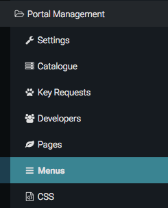
Customizing the menu with the Dashboard
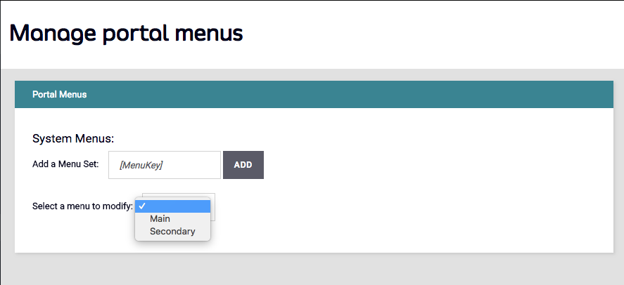
The Dashboard has a simple menu editor, you can create the above data structures from the Portal Management > Menus option
The Portal will come with two menus built in, “Main” and “Secondary”, the “Main” menu will appear in the primary navigation (top nav) of the templates supplied with the Portal, while the secondary will show on the right hand side of the Default Page Templates.
To add a new menu item to the Dashboard main navigation, select the “Main” Menu from the drop down:
Click ADD:
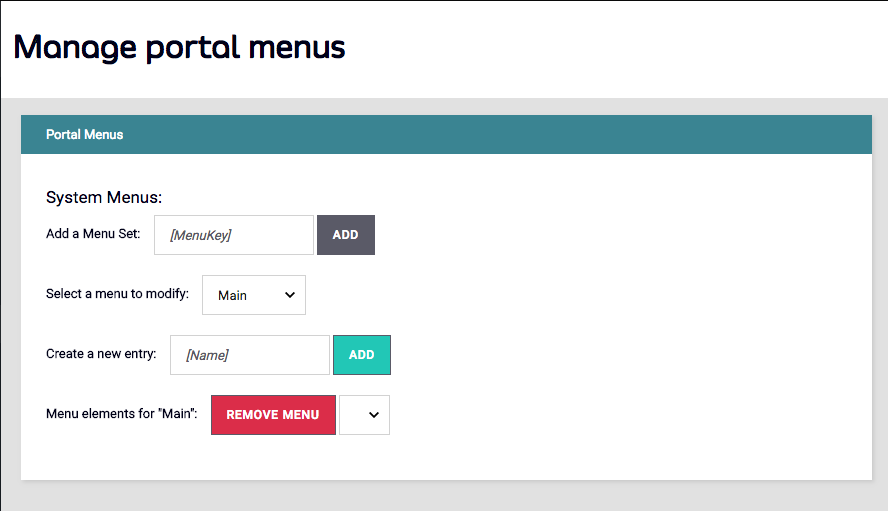
Once added, you can select it from the drop down and add the title and URL fields that will control where the menu item will direct the user.
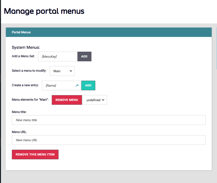
The menu item, once saved, will appear in your Portal navigation instantly.