Tyk Enterprise Developer PortalIf you are interested in getting access contact us at support@tyk.io
Portal Customization Overview
The Tyk Enterprise Developer Portal uses themes for customizing the live portal. We provide an out of the box theme that is using our own branding, it’s called thedefault theme. You are welcome to use it and modify it for your needs, yet if you want to start with a blank page, you can also create a completely new theme.
This section provides a complete guide to full customization from the developer’s point of view.
Workflows for Portal Management
These workflows are designed to help organizations streamline collaboration between developers and content managers in managing the Tyk Developer Portal.Developer Workflow
For organizations with developers customizing pages layout and other technical aspects of the portal pages, we are recommending the following workflow.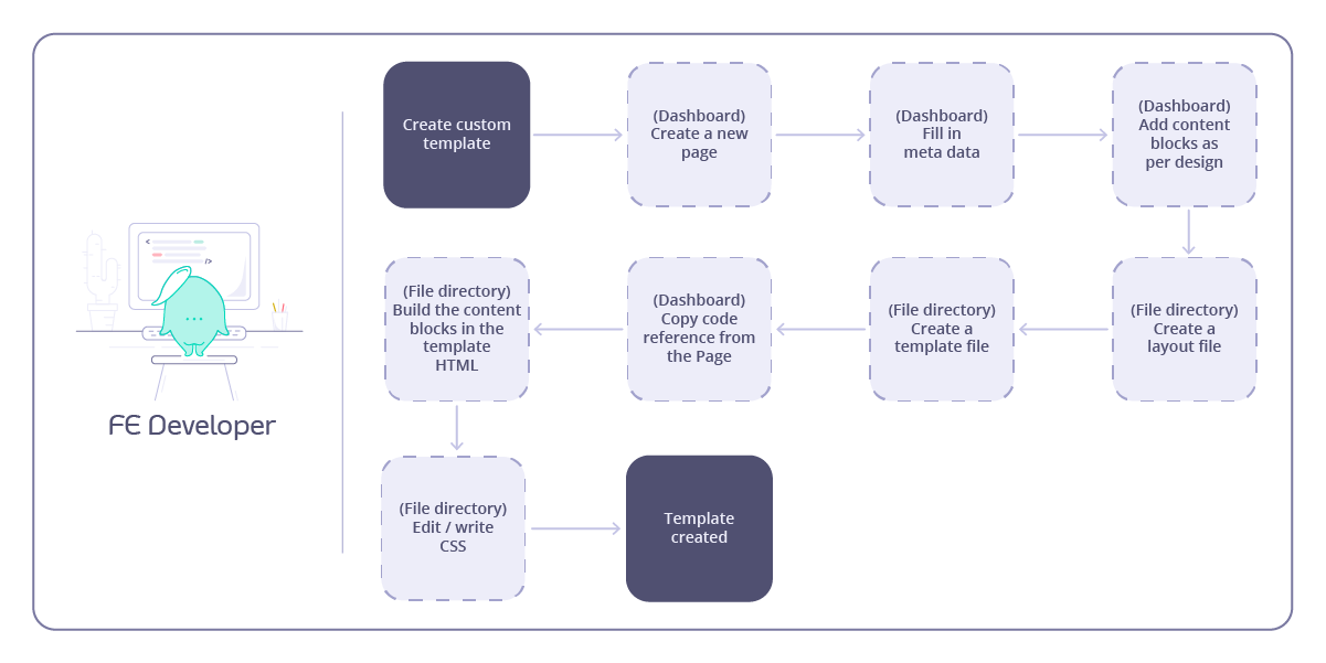
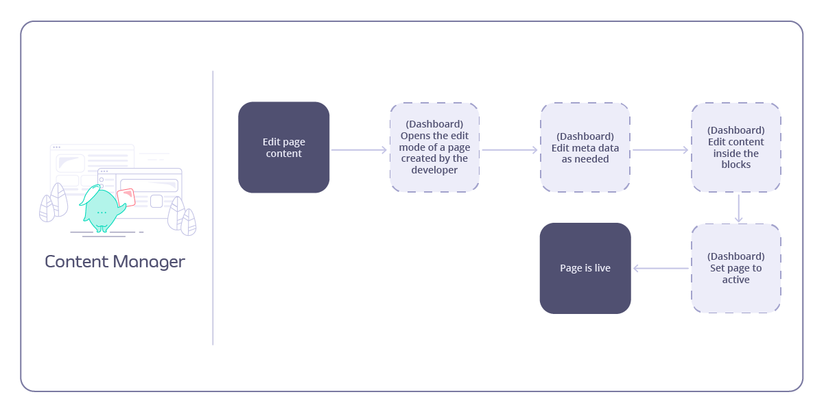
Content Manager Workflow
For organizations with content manager(s) managing the developer portal content, we are recommending the following workflow.