Menus Customisation
Tyk Enterprise Developer Portal
If you are interested in getting access contact us at support@tyk.io
Introduction
The Developer portal has two types of menus:
- The main navigation at the top (in the header)
- The footer at the bottom.
Both of them are defined as partials in the portal directory in /themes/default/partials/.
Manage existing menus
- Log into your portal
- Select Menus from the navigation menu
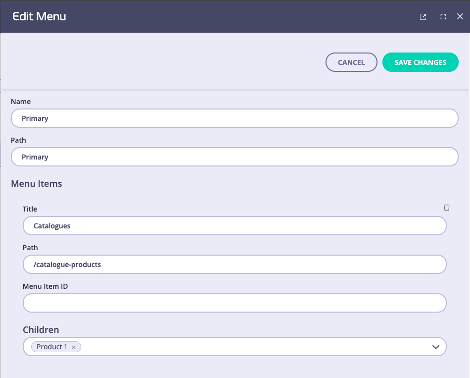
- Click Primary to edit the menu

Field descriptions
- Name: You can give it any name you like, it does not have any effect in the live portal nor the admin app.
- Path: This will be used in the code as a reference in order to render the menu. If you don’t have access to the template files, we recommend that you do not edit this field. Editing the
Pathfor the default menus will hide the menu as there will be a mismatch between the Path and the reference in the template. - Menu Items:
- Title: This will be the text that will be displayed in the live portal.
- Path: this is where the user will be redirected to.
- Children: In this section you add another nested menu item. We have added a dummy item (Product 1) to demonstrate
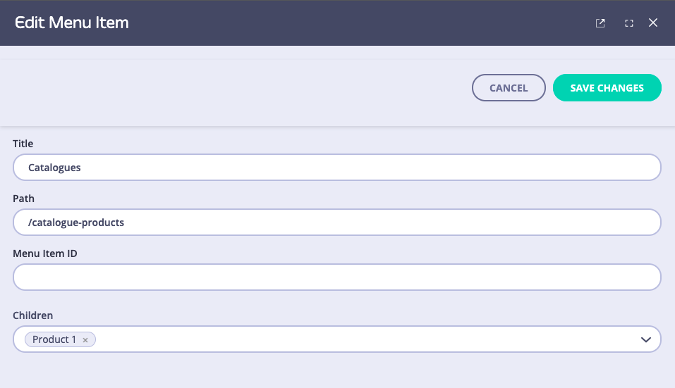
Below is the menu item from its own view, which is available from the Menu Items option in the admin app side menu.

Here’s the menu as displayed in the app:

We have mentioned above the relationship between a menu’s Path and the code reference in the menu template. Let’s see how the main menu template looks like (the file is /themes/default/partials/ directory and is called top_nav.tmpl) for the part that we are interested in:
{{ if GetMenus.Primary }}
  {{ range GetMenus.Primary.Children }}
    <li class="nav-item {{ if .Children }}dropdown{{end}} mr-2">
      <a class="nav-link {{ if .Children }}dropdown-toggle{{end}}" href="{{.Path}}" {{ if .Children }}data-toggle="dropdown" aria-haspopup=”true" aria-expanded="false"{{end}}>{{.Tag}}</a>
      {{ if .Children }}
        <ul class="dropdown-menu submenu" aria-labelledby="navbarDropdownMenuLink">
          {{ range .Children }}
            <li class="nav-item">
              <a class="dropdown-item" href="{{.Path}}">{{.Tag}}</a>
            </li>
          {{ end }}
        </ul>
      {{ end }}
    </li>
  {{ end }}
{{ end }}
Let’s pick each line that is used to render the menu attributes and see how they work:
{{ if GetMenus.Primary }}: This statement calls the “GetMenus” function and checks if there is a menu calledPrimary. If present, it goes into the next line:{{ range GetMenus.Primary.Children }}Each Menu (Primary) has some children (Menu items) so what this code does is loop through all the children and they are rendered as below:
<li class="nav-item {{ if .Children }}dropdown{{end}} mr-2">
<a class="nav-link {{ if .Children }}dropdown-toggle{{end}}" href="{{.Path}}" {{ if .Children }}data-toggle="dropdown" aria-haspopup=”true" aria-expanded="false"{{end}}>{{.Tag}}</a>
Where:
{{ .Path }}is the Path we have defined from the UI and{{ .Tag }}is the Name we have defined from the UI.
So this will render all the menu items (Catalogues - as per screenshot) of the menu (Primary - the name we’ve given to the menu).
{{ if .Children }}: This line checks if the menu item has any submenus. If it does it loops through those children{{ range .Children }}and finally renders them<a class="dropdown-item" href="{{.Path}}">{{.Tag}}</a>similarly as the main menu items. So now the child of Catalogues which we named Product 1 has been rendered.
