The Developer portal has two types of menus:Documentation Index
Fetch the complete documentation index at: https://tyk.io/docs/llms.txt
Use this file to discover all available pages before exploring further.
- The main navigation at the top (in the header)
- The footer at the bottom.
/themes/default/partials/.
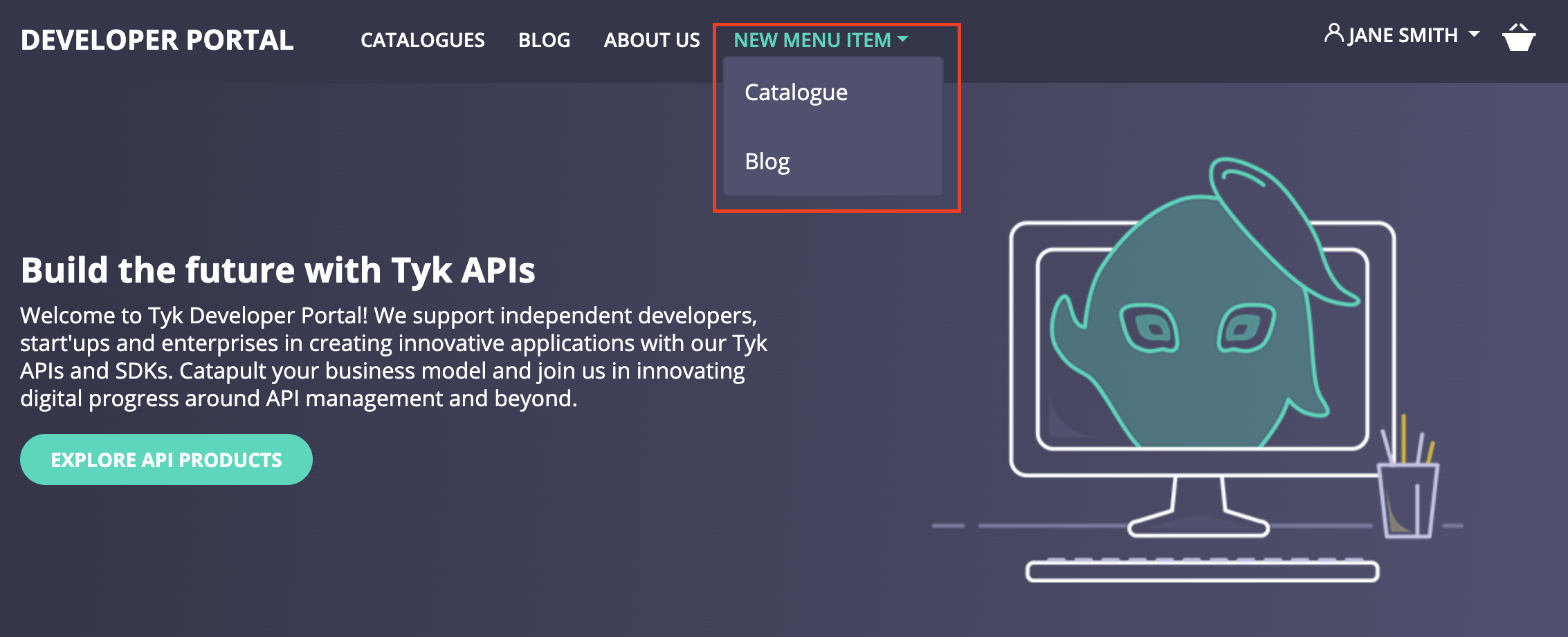
Top Navigation Menu
The Enterprise Developer portal enables admin users to customize the navigation menu that appears on the top navigational bar of the live portal. An admin user can create and manage menu items without any code from the admin dashboard of the Developer portal.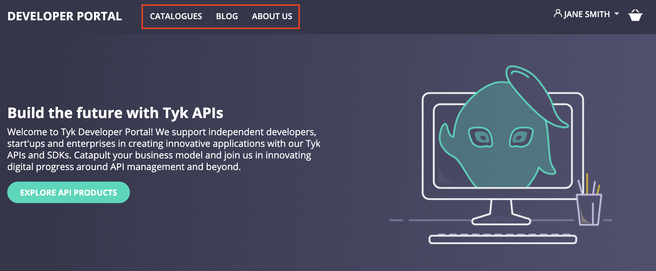
- lead to a specific page or URL:
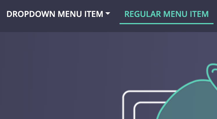
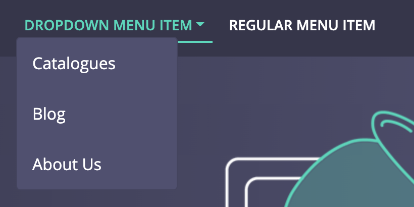
- show a dropdown list with possible navigational options:
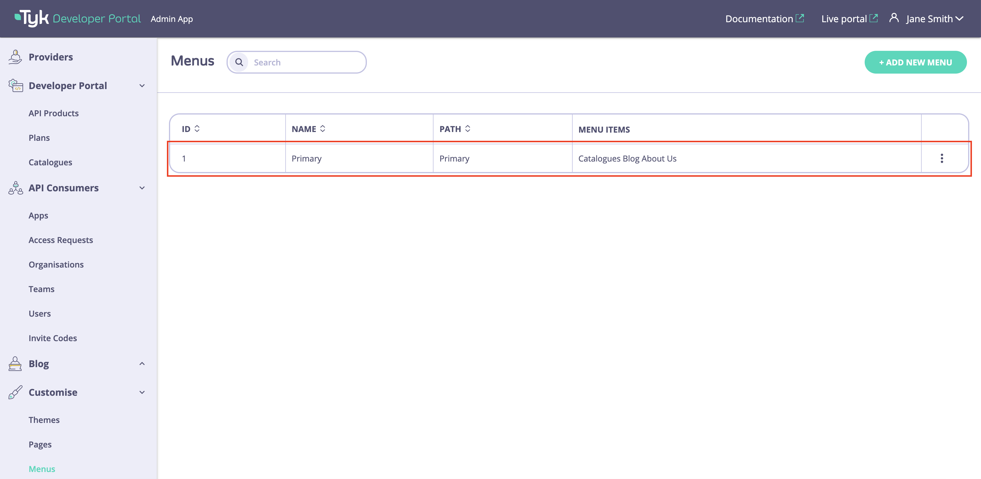
Manage Menu Items
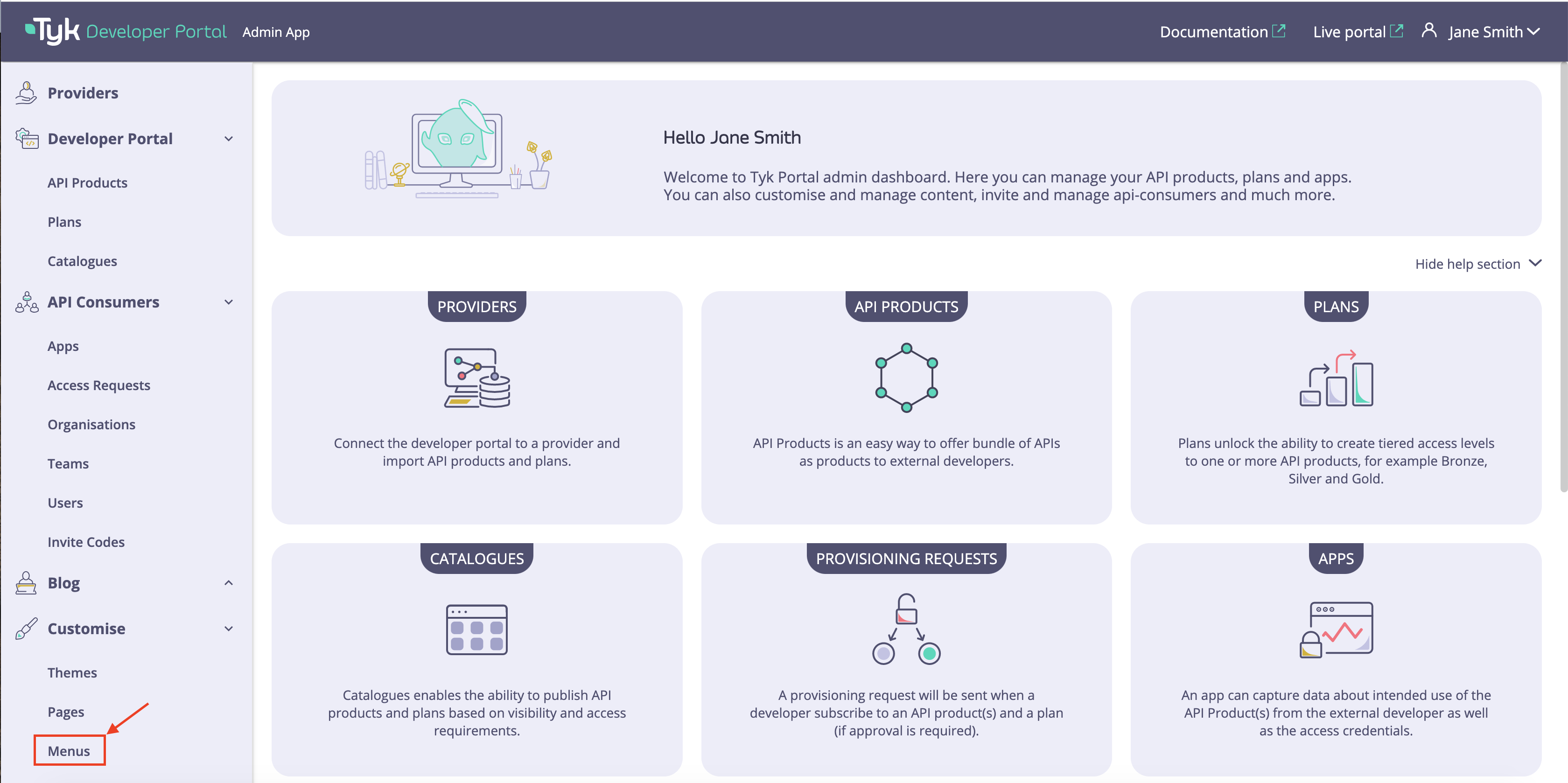
The management of the menu items is done from the Menus section of the Developer portal.-
Open the admin dashboard. Navigate to the Menus section.
-
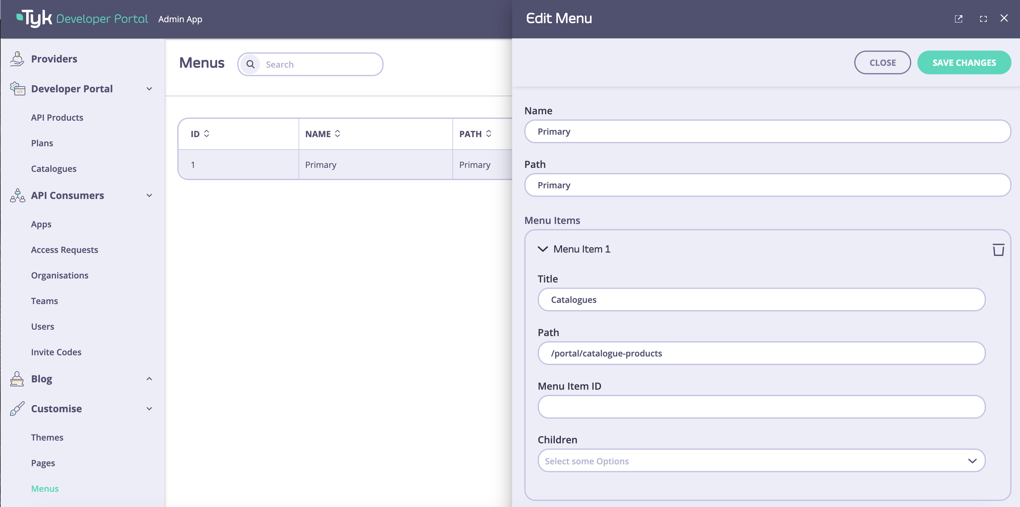
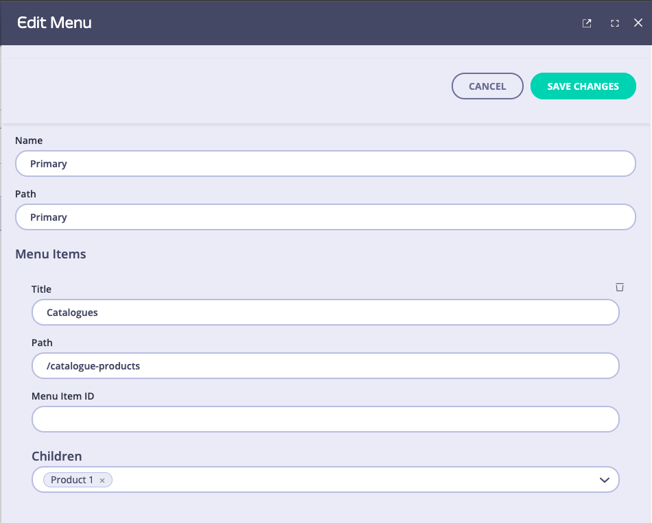
Select a menu that you want to modify. By default, the Developer portal has only one Primary menu. If you want to add more menus and render them on the live portal, please refer to Full customization section.
-
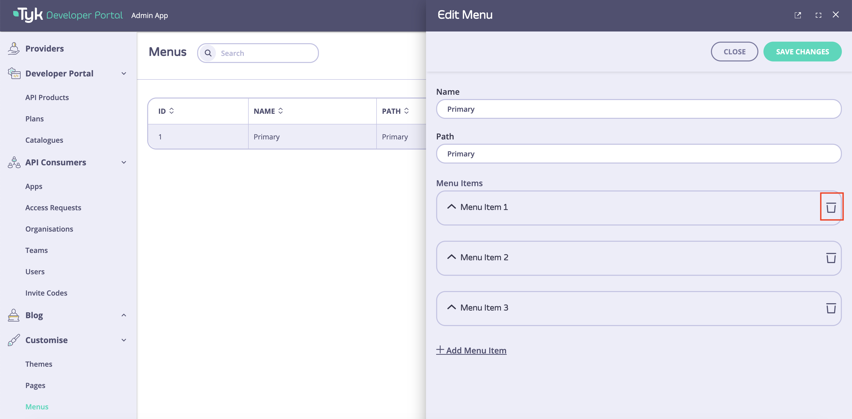
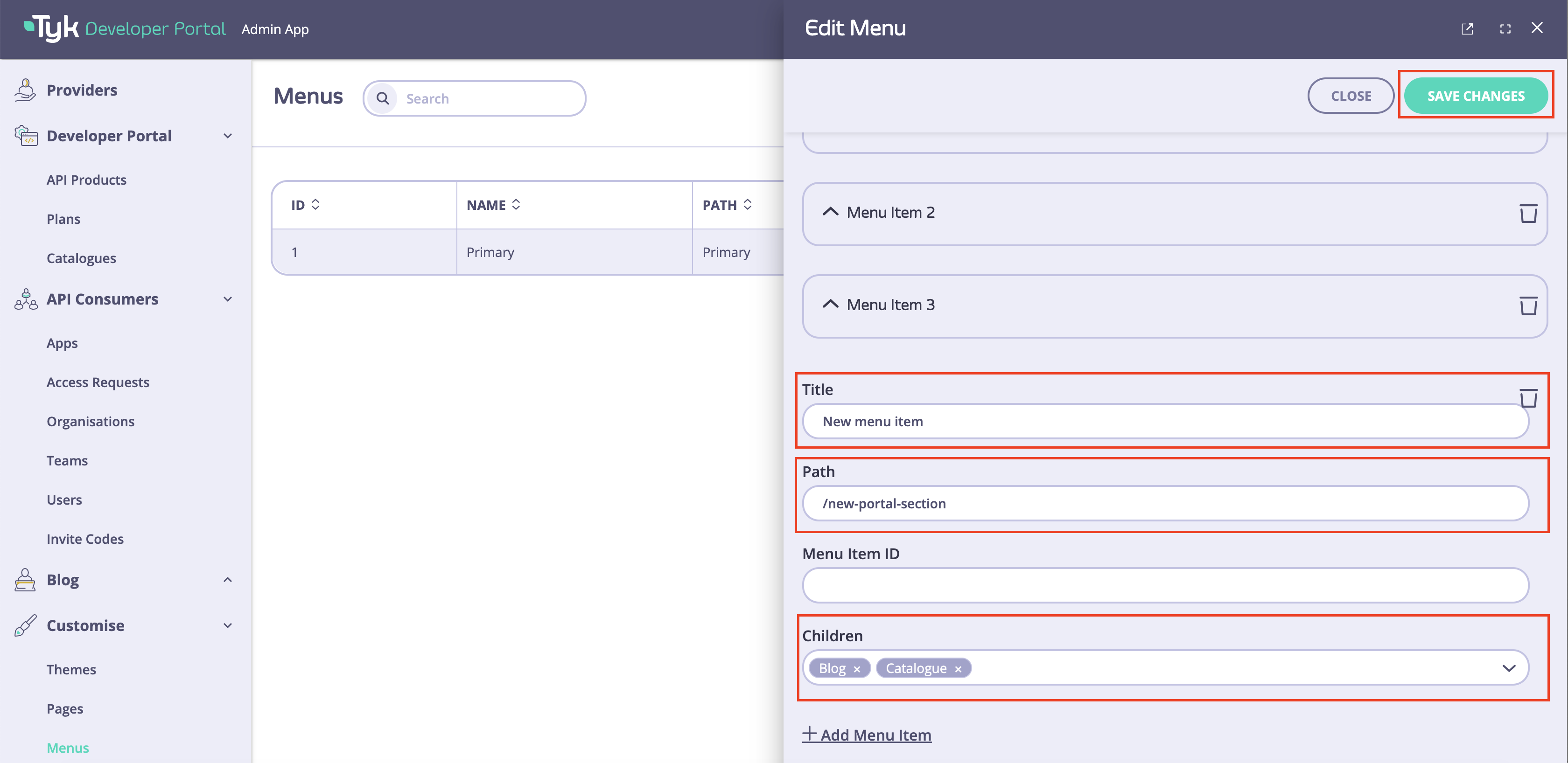
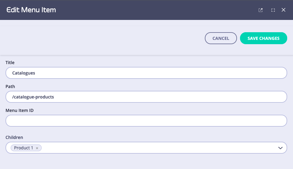
Click on a menu item to modify it. You can change the following items:
- Title that will be exposed to developers.
- Path where developers will be redirected by clicking on that menu item.
- Children items that will be exposed in the dropdown list that will appear when hovering mouse over the menu item.
- To make the changes effectively, you need to save the changes by clicking on the Save changes button.
-
To remove a menu item from the menu click on the bin icon and click on the Save changes button.
Create New Menu Items
To create a new menu item, you need to:- Click on the Add Menu Item button.
- Fill Title, Path, and Children fields. Save the changes by clicking on the Save changes button.
 s
s
Update Existing Menus
- Log into your portal
- Select Menus from the navigation menu
- Click Primary to edit the menu
- Name: You can give it any name you like, it does not have any effect in the live portal nor the admin app.
- Path: This will be used in the code as a reference in order to render the menu. If you don’t have access to the template files, we recommend that you do not edit this field. Editing the
Pathfor the default menus will hide the menu as there will be a mismatch between the Path and the reference in the template. - Menu Items:
- Title: This will be the text that will be displayed in the live portal.
- Path: this is where the user will be redirected to.
- Children: In this section you add another nested menu item. We have added a dummy item (Product 1) to demonstrate

Path and the code reference in the menu template. Let’s see how the main menu template looks like (the file is /themes/default/partials/ directory and is called top_nav.tmpl) for the part that we are interested in:
{{ if GetMenus.Primary }}: This statement calls the “GetMenus” function and checks if there is a menu calledPrimary. If present, it goes into the next line:{{ range GetMenus.Primary.Children }}Each Menu (Primary) has some children (Menu items) so what this code does is loop through all the children and they are rendered as below:
{{ .Path }}is the Path we have defined from the UI and{{ .Tag }}is the Name we have defined from the UI.
{{ if .Children }}: This line checks if the menu item has any submenus. If it does it loops through those children{{ range .Children }}and finally renders them<a class="dropdown-item" href="{{.Path}}">{{.Tag}}</a>similarly as the main menu items. So now the child of Catalogs which we named Product 1 has been rendered.